HB

A Design System for Moonshot

A CASE STUDY

In late 2019 Moonshot's parent company PacterEdge had close to a hundred designers spread out through cities all over the world. We needed a way as a global company to utilize, share, and collaborate with each other on demand as needed.

I was picked to be the lead on an ambitious project to setup the remote style guides, design component libraries, and design systems necessary to maximize the billable hours of our designer resources no matter their location.

To comply with any non-disclosure agreements, I have omitted and obfuscated confidential information in this case study. All information in this case study is my own and do not necessarily reflect the views of Moonshot.

The Challenge

The high level goals were to set something up that was:

My Role

I was the lead designer and technologist on this endeavor. My primary responsibilities included:

  • Research all the top UI design tools and pick the best one for our needs.
  • Research the best UI Kits for wireframing and present them to the Moonshot design team for selection.
  • Set up a global version of the chosen wireframing UI Kit that would provide consistency, scalability, and accessibility to all our designers.
  • Develop a corresponding coded component library that matches styles with the chosen Figma UI Kit, effectively creating a prototyping design system.
  • Develop a user-friendly and updatable Style Guide that lets you easily adjust colors, fonts, icons, and overall styles based on a client's brand. This Style Guide should have the ability to push updates to coded components, so any changes you make in the UI Kit can update the look of the website or app, keeping everything consistent.

Research

To kick off my research I asked my fellow Moonshot designers for recommendations on their favorite UI Kits, tools, and component libraries. I then spent the next two weeks reviewing these and other recommendations found online before presenting them to the Moonshot design team for final approval.

system design reviews

Vector-Based UI Design Tools

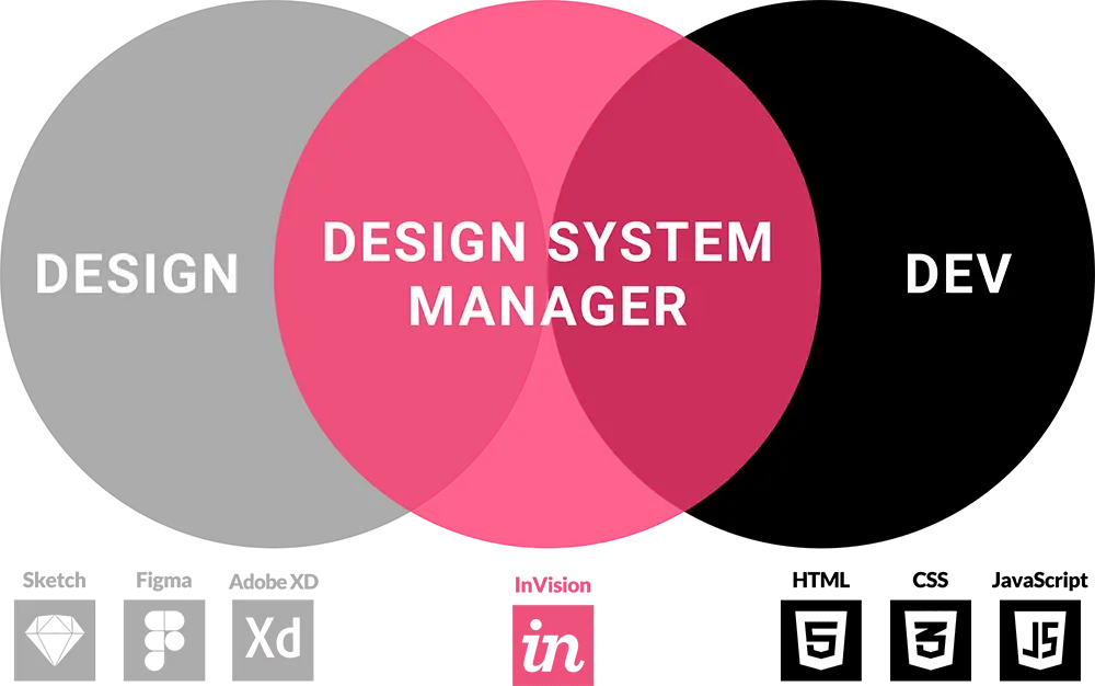
Based on company inventory and team member suggestions of vector-based design tools to use, I created a short list of options to explore that consisted of Sketch, Figma, and Adobe XD. In combination with these vector tools were two additional resources (Abstract & InVision) that, depending on the tool, may be needed in addition in order to support backup, sharing, collaboration, version control, and prototyping.

I researched online and carefully documented reviews of each tool combination, their advantages and disadvantages, and all pricing/cost information. In addition, I downloaded and tried out all these tools myself, making sure to document my findings about what I liked and disliked about each. I then presented my findings to the design team with my final recommendation.

Without diving too much into the details, the team unanimously agreed to go with my recommendation of using Figma as our vector-based design tool.

Wireframe UI Kits

Next, we needed a good Figma wireframe UI Kit. There was no need to create everything from scratch when there are lots of well thought through kits already established that we could start with. After taking more feedback from the team and doing some more online research, I narrowed down our choices to 6 kits (one being a custom internal kit that we had already started).

InVision Form

  • Free
  • No HTML Templates
  • Follows Atomic Design
  • 190 Templates, 200+ Components
  • Comes with wireframe design by default
  • Have to convert to Figma

Platforma

  • $159 for file, $68 HTML
  • Has HTML Templates
  • Does NOT follow Atomic Design
  • 173 Templates, 536 Components
  • Comes with wireframe design by default
  • Comes with Figma version

Prime Design System

  • Subscription ($48 a year)
  • No HTML Templates
  • Follows Atomic Design
  • 173 Templates, 150+ Components
  • No default wireframe design
  • Have to convert to Figma

Frames For Sketch

  • $88 (free updates)
  • No HTML Templates
  • Does NOT follow Atomic Design
  • 140 Templates, 250 Components
  • Comes with wireframe design by default
  • Have to convert to Figma

Cabana Design System

  • $68 (free updates)
  • No HTML Templates
  • Does NOT follow Atomic Design
  • 20 Templates, 150 Components
  • No default wireframe design
  • Comes with Figma version

Custom

  • Free
  • No HTML Templates
  • Does NOT follow Atomic Design
  • 20 Templates, 50 Components
  • Comes with wireframe design by default
  • Have to convert to Figma

Design Comparisons

In addition to research, I spent a few days recreating a few of our older mockups we had designed with our custom UI Kit using each of the other 5 kits for visual comparison.

custom wireframes vs form

And the Winner is...

After doing another presentation to the design team on my wireframe UI Kit findings and showcasing several example designs using each, we decided to move forward with InVision Form. There were advantages and disadvantages of each kit, but after carefully considering Form’s number of components & templates, professional look & feel, and price, we felt it was the best choice for our shop.

It's important to understand that a Figma UI Kit is a vector-based component library for design teams. IT IS NOT A COMPLETE DESIGN SYSTEM SOLUTION. While these kits offer development specifications accessible through Figma's "inspect" feature, they lack the actual coded components themselves. To bridge this gap between the two, we will need to create a coded component library for prototyping and implement the ability for it to use "design tokens". I'll explain this process in more detail later.

Figma Configuration

Now that we knew what we wanted for a UI Kit, it was time to set it all up. This ended up being a little more complicated than I initial thought as the import process, component flexibility, and the library selection was more limiting and broken than expected. These issues would need resolving before we could share out a global UI Kit to all our designers.

Component Flexibility

Even as initially setup in Sketch, the InVision Form kit by default was not flexible. On resize or manipulation of any of the components, they would break. Throw in additional import issues and bugs when we converted everything to Figma, and there was quite a bit of fixing and rework that needed to be done.

fixed broken FIGMA components

Component Customization

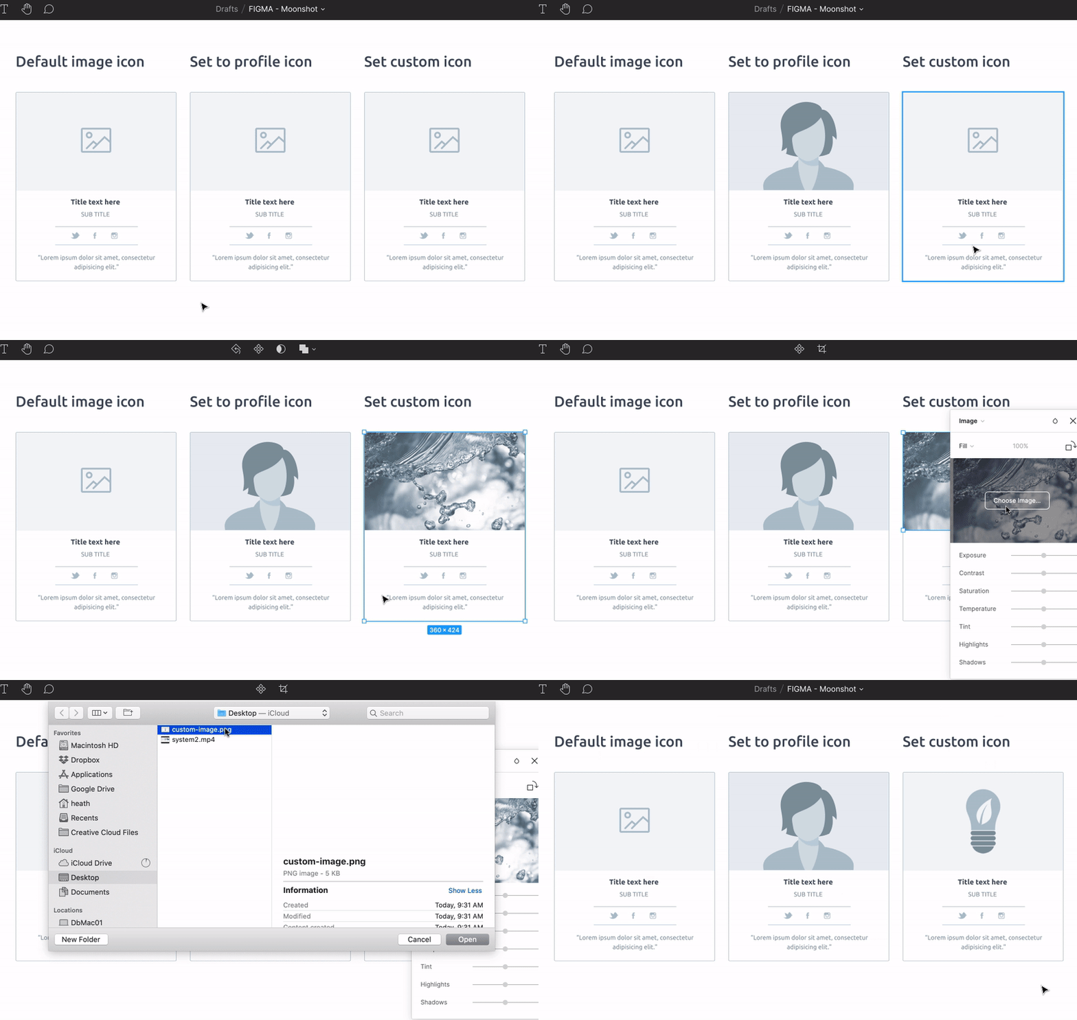
Many of the components that came with InVision Form were redundant to other created components with only slightly different modifications. To simplify and make our UI library leaner and more flexible, I created single advanced components with configurable options that replaced multiple existing components. For example, every card I created had three image options: Default Icon, Profile Icon, or Set A Custom Icon.

created custom FIGMA components

Component Library Launch

After several days of work tweaking and extending our wireframe component library to satisfaction, I followed up with Moonshot branding and incorporation of an Atomic Design structure for all our components. I then set up the UI Kit with example layouts and new Figma Auto Layout grids to inspire and give designers a jump start on new projects. All colors, fonts, and iconography were customizable for easy conversion to client brand specific styles. The final and last step was publishing it out to Figma as a shared library for all our designers to use.

Full FIGMA Component Library

A few more weeks out we launched several small projects using the new Moonshot Wireframe UI Kit. I followed up on feedback from other designers as they used our component library, implementing new recommendations and making tweaks where needed.

Real World Application

Real World Application

Advanced Design Systems

A complete design system transcends vector-based tools and their UI Kits. It fosters the shared use of elements and styles between designers and developers. But herein lies the challenge: how to bridge this gap between design and development effectively. While a definitive solution remains elusive, new tools are currently emerging to explore this very connection.

Design Systems Discussion by InVision

The Quest for a Single Source of Truth

Modern design systems leverage vector-based design tools like Sketch, Figma, Adobe XD, or InVision to create design tokens. These tokens encapsulate styling information like colors, fonts, and border-radius. Developers then utilize these tokens as variables within their production code to style websites and applications. This approach empowers design teams to maintain a single source of truth for styling information, ensuring consistency across the product. It helps bridges the gap between design and development, while fostering close collaboration without requiring them to directly work within each other's specific tools.

Design System Managers

While design tokens are a powerful tool and a significant step forward, there are inherent limitations to consider. Due to the nature of vector-based design tools (Sketch, Figma, etc.), they primarily focus on visual representation and cannot directly generate production-ready code for interactive elements. This means that a designed button in a vector tool won't automatically translate into functional code for developers. However, design systems are evolving to bridge this gap by offering alternative solutions, such as code snippets or integration with prototyping tools.

Don’t blame design systems for the shortcomings of vector illustration tools. As long as design tools enforce the vector format on user interface designers, implementation of a single source of truth will remain impossible.
Marcin Treder
Marcin Treder UX Design Manager at Google

Should Designers Learn to Code?

There can be a significant difference between the vector design and prototyping tools used across UX/UI design roles. While website code adheres to universal languages like HTML, CSS, and JavaScript, the specific tools employed for coding may vary. Even mobile apps can leverage these web technologies to some extent. When considering the learning curve, the question arises: is mastering basic web coding truly more challenging than acquiring proficiency in a multitude of vector design and prototyping tools? It's worth noting that many of these tools aim to emulate code functionality, albeit with limitations. By embracing web coding, the need for third-party design software could potentially be reduced, fostering a single source of truth for both designers and developers.

Code Based Design Tools

Code Based Design Tools

While requiring UX/UI designers to become full-fledged coders might not be the optimal solution, a shift towards code-based design tools could hold significant benefits. These tools directly translate a designer's work into relevant HTML, CSS, and JavaScript, providing a real-time preview within the browser. This fosters a shared understanding between designers and developers by leveraging the same core technologies.

The primary challenge for designers transitioning to code-based systems lies in the loss of familiar drag-and-drop functionality. Code-based design adheres to the rules of HTML and CSS, which primarily utilize inline and block-level elements for layout. Additionally, by default, elements appear in the top-left corner. To achieve desired positioning, designers would need to learn and utilize grid systems like CSS Grid and Flexbox. This represents a fundamental shift from the visual manipulation of elements, but developers already possess this understanding of code-based layout.

...there's way too much information to decode apps and websites. You get used to it, though. Your brain does the translating. I don't even see the code. All I see is grid, carousel, form...
Unicorn UX Designer
Anonymous Unicorn UX/UI Designer

Pattern Lab

Pattern Lab is the code-based design system that I picked to use for Moonshot's advanced prototyping needs. All fonts, colors, and styles used in its style guide are created with real CSS code and can be applied to any components, templates, or pages in its library.

Pattern Lab Styles

In addition to styles, it also allows you to create a library of coded components. These components can then be put together to create a page template, which can then be used to create multiple page instances. The real power comes from JSON data files behind each page instance that tells it what content to display.

Pattern Lab Components

Leveraging the styles from the Moonshot Figma Wireframe Kit, I developed a corresponding coded component library. This coded library can utilize the design system established in the matching Figma Style Guide, ensuring consistency between design and code.

In the future, I hope to see designers embrace code-based design tools like Pattern Lab or its alternatives for prototyping. This approach allows designers to experience the benefits of working with actual code for mockups, prototypes, and even development specifications. Ultimately, it fosters a deeper understanding of the development process and strengthens collaboration between design and development teams.

Speed, Power, & Efficiency

Implementing a design system can be a significant time investment upfront. This initial hurdle is likely a major reason why many design teams and studios haven't adopted this approach. While I've only received official approval for one such project (this one!), I've proactively undertaken design system development in the past, dedicating personal time or finding opportunities between projects.

My experience has shown that the 'ask for forgiveness later' approach can be effective. Once a well-designed system demonstrates its capabilities in terms of speed, power, and efficiency, teams are more likely to embrace it. The key lies in providing tangible proof of its benefits before seeking formal buy-in.

I’m going to march down the page and sort of say, alright, here is a section that needs to do this, and oh yeah, we’ve got a component that does this. And so that actually by the end of it I’ve just got a simple text list...
Josh Clark
Josh Clark Founder of Big Medium

A well-established design system significantly streamlines the design process. In my experience, it empowers designers to focus on more complex tasks by allowing them to efficiently assemble pages using pre-built components. For instance, after implementing a design system at a previous company, I could quickly create mockups for various screen sizes by selecting and arranging components, and updating the associated data. This process not only generated mockups but also produced a basic, interactive prototype with micro-animations – all within a significantly shorter timeframe compared to traditional static mockups. This highlights the power of design systems in boosting efficiency.

You can work with the developer and the interaction designer directly to build out and scaffold out a page using design system components that you've already got. You don’t even need the designer for that because those components are already designed...
Dan Mall
Dan Mall Founder of SuperFriendly

Animations

This type of design system offers limitless animation possibilities. Since I utilize real code, I can achieve any effect achievable in a production-level coded system. Vector-based prototyping tools have significant limitations in animation and interaction capabilities, making them less powerful than their code-based counterparts.

Accuracy

Vector-based design tools can create stunning visuals. However, translating these designs into development code often leads to inaccuracies. Images alone don't translate perfectly into HTML, CSS, and JS. Colors, text, and gradients used in vector tools can appear differently when rendered by browsers using the same code. This creates a significant gap in design fidelity during translation.

Inaccurate Shadow Translation

See this article and this tweet for more details.

Advanced Prototyping

One of Moonshot's goals was to explore integrating new technologies into the prototyping experience. How can vector-based design tools handle prototyping for Voice, AR, VR, and AI? While some offer limited functionalities, they generally fall short in comprehensively prototyping these features.

Pattern Lab, being code-based, can work with any APIs or open-source tools that interact with these advanced technologies. Essentially, anything achievable in production can be prototyped using this approach.

Pattern Lab Examples

To demonstrate the capabilities of Pattern Lab, I built templates and pages utilizing my coded wireframe component library. I then replicated this project and created a new versions styled with real brand guidelines from a previous client.

The Wireframe Prototype

Explore the Style Guide & Component Library, Template, and Page I created using Figma wireframe styles. Click, scroll, and resize website elements to experience the advanced interactions, features, and micro-animations.

The Styled Version

This demonstrates the Style Guide & Component Library, Template, and Page I built using styles from a previous Kraft-Heinz Recipe project. Updating the style guide ensures consistent style application across all components, templates, and pages. However, minor manual adjustments might still be necessary for optimal visual appearance. Therefore, I can refine individual components for a perfect final design.

Design System Insights

While the final design system remains untested in a production environment, initial estimates suggest potential cost reductions and significant efficiency gains. However, it's important to acknowledge that these are estimations and the true value will be determined after implementation. Although not a universal solution, the design system effectively met our specific project requirements. As design tools and technologies continue to evolve, it's reasonable to anticipate the future possibility of a single, comprehensive solution bridging the gap between design and development.

200%

Faster and more efficient than existing design shop setup

60%

Cheaper than existing design shop setup

100%

Collaborative, usable, scalable, backed up, consistent

100%

Prototyping options and capabilities